Artist looking for mentoring and or project

Hi Cathar. Just wanted to say I really like your art style. Keep it up! Cool to see talented people like you on the forums.

Don't worry to much about palettes, dithering, resolution, or any of that crap. Sometimes there is a point where all that stuff pile up, it sucks the joy out of the hobby and you forget why you're creating this content in the first place.

As long as you understant that the first color in the palette is the transparent one, and there's no antialias outside of your sprites (these are things you already know), you're good to go.

Let me know if you want to do a collaboration sometime. I'll probably be interested. Good luck!
 
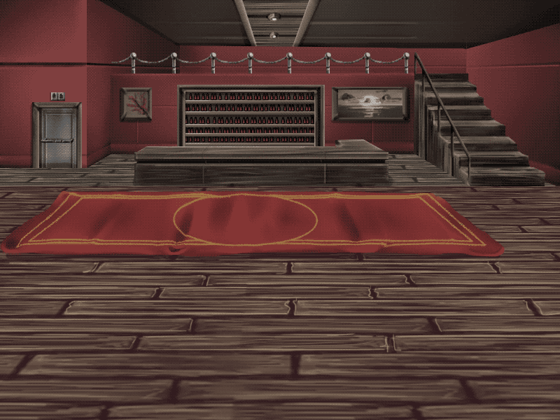
Cathar, your bg is great already. For this kinda of background, you don't need to split it into two parts like this. One image declared as panel is sufficient

Also I noticed that its palette is not right i.e both parts don't have transparent color as their first color in the palette. It should be like this:


This image only use 33 colors (including transparent color) which is far from 256 colors limit. If you have better version with more colors, don't hesitate to use that one (indexed that is)

Oh yes, about splitting, panel and background are seperated cause each has its own scrolling speed. For this bar, single image as panel is sufficient but the city in your first image in this thread requires two images i.e buildings as background and highway as panel
 
Bloodbane said:
Cathar, your bg is great already. For this kinda of background, you don't need to split it into two parts like this. One image declared as panel is sufficient

Also I noticed that its palette is not right i.e both parts don't have transparent color as their first color in the palette. It should be like this:


This image only use 33 colors (including transparent color) which is far from 256 colors limit. If you have better version with more colors, don't hesitate to use that one (indexed that is)

Oh yes, about splitting, panel and background are seperated cause each has its own scrolling speed. For this bar, single image as panel is sufficient but the city in your first image in this thread requires two images i.e buildings as background and highway as panel

I agree but the background has a lot of color loss from the first background he had that is why i told him to do it that way :) But listen to blood he knows a lot more thann i do lol And DC is right remember to avoid using anti-alias, gradients or too many colors for your sprites and backgrounds.
 
I find that hard to believe - you've obviously got some art chops.

I've been drawing for a long long time, but I never went into pixel art. That's why I need to find a way to translate my art into sprites. I could take the long route and learn pixel art from scratches... but we're talking about a five additional training years to come up with something decent.

About gradiants, I definitely see your point. I looked into Eternal Champions and I kinda understand what they did wrong. Let's be real, it's ugly as hell (imho :u), but the reason it is is because they do gradiants from and to two different colors.
When I talk about grads, I'm talking about something light, like light red ->dark red. Even with few colors, it can achieve a good result (I think).

Like for exemple, here is a real size comparison of my sprite with EC sprites
eh_by_number_seventeen-d9yjddg.png

Highly saturated junk pixels : wanted for sexually assaulting my retinas

I mean, of course I have less limitations than they have (the girl has 16 colors, my dude has 30), but I think the problem comes from the color used more than the indexation method here.
I don't say that to argue, you know probably way more than I do, but I'm still in the process of finding a method that is both time effective and doesnt drives the player to suicide.

Edit : Additional critique would be - that color scheme is a big no to me. It's made of secondary colors (purple green orange) and those colors used together have a visual function to make things look ugly. It's commonly used by marvel to color their villains as they are naturally repulsive when used together

Also I noticed that its palette is not right

Sorry ! Its corrected in my local files. I reunited the two and I added a transparancy color. This is just me bumping into another wall, sorry again

Cool to see talented people like you on the forums.
your art is impressive, im keen to see how it translates to a game.
;A;
Sure I'd love to collab. Just let me gather my pebble and understand what I'm doing for some weeks and I can do that

For what it will give ingame, probably something with lots and lots and lots of enemies. Some allies. I want a big big brawl in this poor little bar

Edit :

I tried to draw the next sprites in palette-friendly colors, im quite satisfied with the results. I might end up redoing the protagonist completely in the future. We'll see.

http://orig02.deviantart.net/5d24/f/2016/101/6/f/test_by_number_seventeen-d9ykhyl.png
http://orig07.deviantart.net/d475/f/2016/101/9/1/test00_by_number_seventeen-d9ykhxl.png
 
About light effect on BG you can look at Rushing Beat Mod
http://www.chronocrash.com/forum/index.php?topic=899.0

But Joshiro seems to do it inverted.
By adding a dark layer on everyvere except the light sources.
I think you can easily replicate it by watching his mod (stage du vestiaire, il me semble)
 
test_by_number_seventeen-d9ykhyl.png
test00_by_number_seventeen-d9ykhxl.png

Yeah this enemy looks good, it's a good idea too to do colour like this too.  Even if the end result will be the guy wearing all black, it's best to use colour for easier transition to pixels.  It will also avoid lots of shared colours later on (like tons of black/grey shades) that can only really be fixed by redrawing over them.  Also be wary skin colour, it's so close to yellows/reds/browns etc.  it can be a pain to fix later on.

The same shoud be done for the main char if possible.  Example make his skin green,  pants blue, shirt red, jacket purple, shoes yellow etc.  It's easy to identify later on.  Try to avoid white and black except for outlines.  This will also allow for more interesting remaps.  For enemies this will be important to have, so one enemy can be dozens of different variations.

In the end, the sprites will look like they're going to mardi-gras, but in game they will have the proper palette applied.

grob_by_diegoloso_d7gsb66.png

 
Yeah... Im beggining to consider with horror the possibility I might have to completely redo this walk animation of the death.

Also yes, for my sprite work, working with four colors is the way to go. I don't want to add more, because of one reason - namely they tend to overlap really quick (especially in the extremes iof the light spectrum), increasing cleaning time by a margin for each additional color. So the colors are basically Skin (purple), main color (yellow) and two complementary colors that I use to make the character stand out by himself.

Even tho I'm loosing on details, the recolors tend to be more powerful anyway. And I'm down to 22 colors. So...maybe ?
eh_by_number_seventeen-d9ynkuy.png


Edit : Alright, so. I used this method with my main character. I just have to redo this 7 sprites walk animation and I'm back to dot zero. The cool thing in this is, it will allow an infinity of pallettes for him. The bad is I lost some details but who cares

spritesheetlandrelowres2_by_number_seventeen-d9yp9tr.png
 
I tried to get one of your spritesheets and make a details as well :D

cfd2ea58-62d8-4dbe-9e5a-709b7aadc8ed_zpsezuzl99p.png


Edit:
Btw, try to make a few changes, and additional details to make a character more appealing depending on your style.

Edit:
Oh, i edited the sprite this time. Try to revising the sprite or remove some pixels if necessary and see it if its good or better looking. Don't get rushed when making a sprite and take your time to make it more better.
 
Wow, I totally love what you did to the pants and shoes. I'll totally use that for inspiration to rework some of the sprites

Also I remade that walk animation. So I'm effectively back to where I came from, with one actual working character

Edit : Altho I understand that the more time you spend on a sprite, the better it looks, you have to consider that a basic character is around 40-50 sprites and I have some 20+ characters to make to come up with a game that is remotely decent. Quality doesn't always win against quantity :(
 
Hoped that helps.well, yea. Actually it depends on the animation and the gameplay for the quality. So if you want quantity, try to make balanced between them since your getting started on spriting. And if you learn alot you can manage between quality and quantity. Try to make eye catching to the audience. So, do all your best as you can :)
 
Also, I've been suspecting After Effect could help for some transitionary frames or animating low movement frames. So I tested

output_wurdjn_by_number_seventeen-d9yshaj.gif

Turns out it works

I'm just posting that to let people know that idle animation can be made to move really easily. Maybe people can be interested I don't know
 
Cathar said:
you have to consider that a basic character is around 40-50 sprites and I have some 20+ characters to make to come up with a game that is remotely decent. Quality doesn't always win against quantity :(

As miles posted, you need to pick good balance between quality and quantity. You can try to be like old beat'm ups such as Final Fight who only use couple frames for character's animations.
IMO it's best to get your mod done first even with not smooth animations. You can smoothen the animation later
 
So... I've been working hard lately, and the first enemy is coming along as I want him to. There's still a lot of work to do but eh.

_9eaa1a5655e17ec0b401ec0bafccc8efa77a250d3a47266e9_by_number_seventeen-d9z3ibx.png

I'm quite satisfied

Next step ; the HUD.
 
Very good job Cathar On t'arrête plus...

About the sprites, they're OK yo me.
I would edit the middle tone or darker tone for any zone.
Exemple:
Punk's green pants : medium geen seems a little too light.
(It's just tweaking it a bit)
Same for the skin.
But anyway it's OK.
 
Could you send me a png with the color you propose so I can try them out ? All the characters will share the same color numbers, and all the palettes will be compatible with all the characters. It will save me a lot of time. So even if I don't use the ireland green palette for this enemy, I can use it for another character and so on
 
So, ehm. I worked overtime and I finished enough sprites to make that first enemy workable. It took time, effort, sweet blood and angry tears of rage, but it's done. Now I know how to implement it, so I won't annoy you guys with it. But I need help with the HUD and the...light effects ? I already made the sprites, because it's easier to show than to explain.

If you guys can direct me to some tutorial / part of the manual to look for in order to implement those things, I would be infinitely grateful OTL

hud_by_number_seventeen-d9zc1df.png

The HUD. Its size has been designed for
800*600 resolution, to fit four of them.
slash_effect_by_number_seventeen-d9zc1k9.png

I'm pretty sure I saw those things on some openbor projects I played
And they are actually pretty chill to make

Edit : For the sake of those who want updates on my poor little work, I think I begin to understand how sprite work. The key seems to be drawing frames in high res, indexing it, then correcting it manually... Boy it will take time but I think it worth it.

I will continue to work with low grade sprites for the moment, while refining them when I feel like it, as it is not exhausting, but very long.

eh_by_number_seventeen-d9zi896.png

Before/After
 
For HUD usually modders use player's icon to store that image. For lifebar etc, you need to modify some settings such as these:

p{#}life {x} {y}
p{#}icon {x} {y}
p{#}mp  {x} {y}


you can find the rest in manual under HUD location section

For the light effects, you mean that swing FX? the best way is to set that as seperate entity then spawn it in punch animation
Oh FYI, you can set alpha transparency to that FX if you want
 
I have some issues with both actually. For instance, using the icon for the HUD will result in the hud changing colors according to the player's palette. Can't it be done with an "none" entity instead? Nevermind. By browsering the forum I saw you made a script for that. If I can't do that without scripting, I'll postpone for now.

Also, the spawn function is limited to 600 occurences per scene, which can be reached rather quickly if it occurs each time the player attacks.

Is there any way to bypass that limitation ?

Edit : Although...Both are details. I can worry about them later. I'm concerned about that 600 spawn limit tho.
 
Back
Top Bottom