You are using an out of date browser. It may not display this or other websites correctly.
You should upgrade or use an alternative browser.
You should upgrade or use an alternative browser.
Night Slashers: Remake
- Thread starter O Ilusionista
- Start date
NED
Well-known member
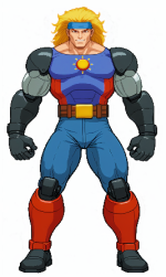
Ok, things are getting interesting I suppose.New character ... and we have a crossover here
I liked the idea. Maybe Karnaov can join too?
I still prefer the classic pixel work. But why not.
Also, I hope they will add more extra characters... Yungmie would have been fun...
Of all the chars from Fighters' History / Karnov's Revenge, I 've always found Liu Fei Lin one of the most interesting ones: She has a distinctive fighting style (mantis or slt), a distinctive look, a personality / gimmick of sorts (actress with a bit of an ego) and last but not least, doesn't rely on cheap fanservice.
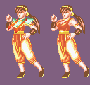 Well, almost no fanservice.
Then again, I fail to see how she integrates with the subject (a gory zombie hunter story), since she's just, again, an actress, not a monster hunter or anything like that.
 Well, almost no fanservice.
Then again, I fail to see how she integrates with the subject (a gory zombie hunter story), since she's just, again, an actress, not a monster hunter or anything like that.
Caliber30 Recon
Member
Data East all-starNew character ... and we have a crossover here
I liked the idea. Maybe Karnaov can join too?
Methinks that Hong Hua's ending might be changed and they replace Her sister with Liu Feilin,Ok, things are getting interesting I suppose.
I still prefer the classic pixel work. But why not.
Also, I hope they will add more extra characters... Yungmie would have been fun...
if not,
then the only thing that can keep this game afloat is the inclusion of more Data East characters...
there are many to choose from:
a James Bond type
an Indiana Jones type
Bunch of other fighters....
lots of possibilities
Methinks that Hong Hua's ending might be changed and they replace Her sister with Liu Feilin,
if not,
then the only thing that can keep this game afloat is the inclusion of more Data East characters...
there are many to choose from:
a James Bond type
an Indiana Jones type
Bunch of other fighters....
lots of possibilities
I can think of an easy one that would bring in the nostalgia crowd: Blade & Striker. Are they bad enough dudes to stop the zombie apocalypse?
DC
Oh man the graphics is so much worse than original, what they were thinking? ai upscaling and smudghing colors is not going to make the game better, its not an upgrade visually.
Its the black outlines, imo artists should pay a penalty when they use black outlines and the style is not comicbook for everything. It just looks i dont know - lazy ?
Line weight- line are wayy to thick, also walking speeds are all wrong and all chars are floating .
It kinda reminds me of asset mashup demos for unity.
+ its a bad idea to redraw the stages so its like the old one but with upscale filter applied cause its kinda the same game, some new stuff would be much better.
Last edited:
Its the black outlines, imo artists should pay a penalty when they use black outlines and the style is not comicbook for everything. It just looks i dont know - lazy ?
Agreed, but it seems to be the style these days. Look at SOR4 as an example. Widely regarded as excellent artwork, but it's all hard black outlines everywhere. Makes me wonder if I am doing something wrong not using them for my own project.
DC
I don't know why the dead enemies look more alive than the playable characters and also Liu Feilin's basic jab hits twice for no reason, I slowed the video down to check I wasn't seeing things  I recommend slowing the video playback speed, even the screen shake is terrible.

Look at it
IMO Data East never had very good artwork, and they really didn't know anything about palette choices (the Vampire boss always looked garish and silly to me). Yet compared to this new version they're all Michelangelo.
Look at the old uppercut. He's leaning into it with a body twist; you can see the effort and technique. New Jake is arm punching with an absolute flat viewpoint. No depth at all. His leading leg has less outline priority than the hip, which in this pose makes no sense. They also gave his wrist an unnatural bend.
Then the animation... I mean, really? Look at this. These images are two frames back to back. There's absolutely no transition at all from one attack to the next. WTF?!
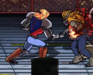

Overall i dont really get the slashers excitement, the game was not emulated for awhile and it got this unattainable status but when i actually played it, it was pretty slow, i enjoyed final fight way more, or violent storm.
I think this is some small studio acquiring the license to do the game, thats why it looks so off despite all the frames being drawn by hand, i mean they could kept the designs but why would they draw over sprites. And that dot pattern from spiderverse....
Similar with Streetfighter HD, lon ime ago i iked the sprites but UDON can do so much better, animations were pretty bad and pivoty in it. They should really try to redraw or at least deform every frame . IT does not hold up imo.
These "hd" remakes... not really a fan. They look like demakes.
wow a throw, offsetts all of enemies in midair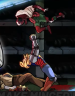

Grit
Well-known member
It should have been Karnov,New character ... and we have a crossover here
I liked the idea. Maybe Karnaov can join too?
wow a throw, offsetts all of enemies in midair View attachment 8142
I had noted this in my post, but it didn't show for some reason. This is one of two huge deal-breakers for me in nearly every modern beat em' up. First, absolutely no weight or impact to anything. Second, grappling that (if it exists at all) is completely disjointed. SOR4 has this problem a lot too, and so does nearly every other new beat em' up. It's like BOR clone syndrome all over again.
I mean, come on. They had this stuff down pat all the way back in the late 80's. Why can't modern devs figure it out?
DC
There was no way, in this diverse and inclusive times it had to be another female,It should have been Karnov,
and either way it made sense 2 males 2 females.
No objections here
The ugly truth, this game looks like a late 90's early 2000's flash Remake somebody made for newgrounds -
Some might say maybe the studio found it on some dusty vault, made some sort of "recompilation" deal and uneashed it into our troubled times,
so once again the olds are subjected once again to another franchise being eroded....
@bWWd , it will probably serve well as one of those IP shenannigans, but applied to this and maybe other Data East stuff...
"The 1994 Fantastic Four movie was never intended to be released and was made solely to maintain the film rights to the franchise."
Data East had imho mid-to-good artwork in their 90s games, but what always caught my attention from those is that they relied less on variety and more on complexity on their enemy mooks: in short, their games had very few enemy types, but they gestured and had more movements and maneuvers than those from rival studios. Starting with the ninjas from "Bad Dudes" to the cavemen from "Joe & Mac" or the "Totally-Not-Natzis" from "Cliffhanger".IMO Data East never had very good artwork, and they really didn't know anything about palette choices (the Vampire boss always looked garish and silly to me). Yet compared to this new version they're all Michelangelo.
In "Night Slashers" D.E. went the opposite way, like they had done with "Crude Buster", by creating a ton of enemies with very few moves...but the bosses and mid bosses were original, so that's something.
Last edited:
Bloodbane
Well-known member
So that's the new character, interesting.
Her preview video confirms my concern about enemy AI. I can see the knife zombies are waay easier there. And a zombie could sneak behind her without doing anything before she kicked it.
The only things the video doesn't show are coop attacks with other heroes (if they decide to remake these moves also).


